Slice and dice: that's how I think about the calculus topic of Integration - take something complicated, slice into increasingly fine slices, then put it all back together. In my quest to encourage my students to see this theme in the wonderful world around them, here is a selection of images I used this term to help show the idea, generously made available by people around the world through a Creative Commons License on Flickr. If you're taking great photographs - think about sharing them under Creative Commons - a wonderful resource for teachers to help inspire students.
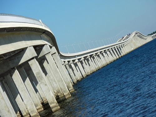
Bay St, St Louis Bridge by Alaskan Dude on Flickr
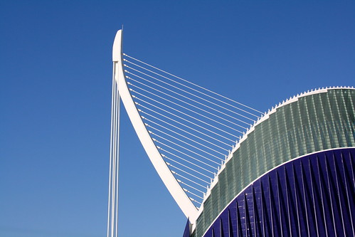
La Agora, be el.manu on Flickr
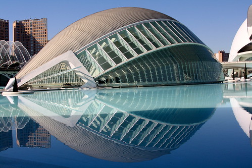
L'Hemisferic by el.manu on Flickr
Tower by timtom, on Flickr
Untitled, by SymoO, on Flickr
The idea of looking for visual representations inspired one of my students to take a photo of the magnificent Neuroscience Research Australia under construction across the road from our school - which just screams at me "Area under the curve!" every time I walk past it.
Neuroscience Research Australia building 2012 - under construction.
Photo by J Yu - used with permission.
"Have you ever noticed .... ", I said to my senior maths class, as I walked in bearing a huge and very obvious glass bowl containing about 40 packets of Smarties, ".. how some people seem to have so much more than other people?"
I then proceeded to "share" out the Smarties: first I gave 20 of the 40 packets to one student - making a huge pile on her desk. Her eyes popped out - while the other students looked with disbelief and some concern for their own anticipated share. I gave a wicked grin and 10 packets to the student next to her. To the rest of the class I handed out 2 or 1 packets - apart from a few students at the end of line who received nothing. Oh the looks they gave me!
And so we started a lesson exploring the question of how we could measure income distribution - a hook (although the class didn't know it yet) - to introduce our next calculus topic: integration. Here are some notes on my first attempts at a lesson design using an idea from economics as a motivation why we might want to find the area between two curves. But first a big thank-you to mathematics teacher Alastair Lupton who showed me how to bring the Gini Coefficient into the classroom and encouraged me to try it out in my classroom.
So here's the sequence I tried this year.
Step 1: Build interest in the problem. With strict instructions not to eat or worse yet - share - their Smarties, we looked at a short OECD video about the rising inequality in income distribution:
Depending on the time available, you might want to explore some other video material, perhaps some recent news footage of the Occupy movement protests, or look at some studies of global income distribution.
Step 2: Thinking how to organise the data: I lined up the students, holding their very unequal distribution of Smarties. We ordered the line by 'income' and partitioned into 5 groups - helping the students see the organisation of the data into quintiles. We returned to our desks and looked at some local and international data on income distribution, also organised into quintiles. Here is some recent Australian data:
Step 3: Ask the question: "How could we measure inequality?" This isn't easy or obvious. Give the class some time to explore ideas. Then it's time to look at how economists do it... Step 4: Develop the idea of graphing cummulative quintiles. After trying some different ways to plot our quintiles, I showed the students how the economists do it: reorganising the data into cummulative quintiles. This allows us to make normalised curves which work for all situations, regardless of the size of the total income pool. We drew our first Lorenz Curves:
The Lorenz Curve is used to calculate the Gini Coefficient. The area A is the difference from total equality.
The larger the area A as a proportion of the total area A+B, the greater the inequality.
Source: Wikipedia Lorenz Curve Image by Reidpath,
To help explore the idea, we discussed what the Lorenz Curve would look like if one person had all the Smarties, and if all the Smarties were shared equally. We also considered if the curve would ever go above the "Line of Equality" (it won't!). We selected different data sets (see references below) and plotted them. Here is the 1993 World Bank data for Nigeria plotted in GeoGebra, with a polynomial fitted to the curve:
By modelling the curve with a polynomial, we can use integration
to calculate the area under the curve and hence the area between the curves.
Data is entered into the GeoGebra Spreadsheet window, then plotted and
a function calculated to fit the data using FitPoly[].
Step 5: Ask the question again: how could we measure the inequality? After looking at a few different data sets, students will quickly come to the conclusion that measuring the area between the line of equality and the Lorenz Curve will give us a nice single number. And now you have them hooked: here's a very interesting and practical reason we might want to be able to calculate the area between two curves.
Step 6: Declare a communist revolution. I then ordered a redistribution of the Smarties so everyone was equal. This was actually quite funny because several of my diet conscious students insisted they did not want any Smarties. Tongue-in-cheek I told them this was not an option - it was a revolution and everyone had to be equal whether they wanted it or not! A nice opportunity to open up the discussion to different views about income distribution. I gave my students a selection of recent articles from The Economist which seemed to provide a good balanced discussion on the topic.
Step 7: Begin the mathematical discussion on ways to calculate the area between the two curves. Your students will have many useful ideas! Try them out with the tools available. And now you're ready to start a calculus based exploration: What is the area under a curve?
Where could you go with this lesson idea?
Get students to make up a small poster using their data and stick them up on the wall. Then as you move through the Integration topic, you can refer to them in the context of each new idea.
Once students know how to integrate, get them to model their curves as a polynomial - I like to use the GeoGebra FitPoly[]function - and then do calculate the integral, comparing their result to given Gini Coefficient for the data set.
The student data makes for a great application of the Trapezoidal Rule : they can calculate the area without knowing the equation of the curve. A good example of why you might want to use the numerical approaches to calculating integrals.
Challenge activity: calculate the area under the curve using Simpson's Rule. If you only have the standard Simpson's Rule, you can't do it because there are an even number of data points! But there is more than one Simpson's Rule - challenge your students use the internet to find one that will work for this data. [Hint: Simpson's 3/8 rule will work].
Apply the concept of the Lorenz Curve to another field of study. An interesting application is to social networks - some people contribute significantly more than others, while others 'lurk' in silence. I use edmodo with my class and there is a high degree of inequality in the number of postings per student - counting postings per students could make for an interesting Lorenz Curve.
Thinking beyond the mathematics:
Talk to the economics teachers at your school. I discovered mine do teach the Gini Coefficient, but they don't go into how it is calculated. I think it could be a very powerful lesson to develop a sequence of combined economics/calculus lessons with an economics teacher at your school. The more I explored the subject, the more interesting I found it. Options to consider include: the effects of taxation policy on the Lorenz Curve; the differences in the Gini Coefficient between different types of economies; differences within one country over a time series; challenges to the validity of the measure; economic and social arguments on the topic of income distribution. All highly suitable for deeper mathematical and social science exploration.
Take some time out to look at the Gap Minder website which options to view the data through the Gini Coefficient.
Resources
The Wipedia pages on the Lorenz Curve and the Gini Coefficient are a good starting place, with good entry points to more nuanced discussion on the use of the Gini Coefficient.
The October 23, 2012 issue of The Economist contains some excellent articles on the challenges of income inequality seen from a pro-Free Market view. I found these particularly interesting given one could hardly call The Economist left wing!
Some teaching reflections:
The students really loved the lesson - they were engaged and it was interesting.
I planned carefully for my 'inequitable Smarties distribution'. Our class was well established and we knew each other well enough that my students would know I was up to something and trust me when I played this game. I also made sure the students who didn't receive Smarties were the most resilient, confident students.
I did however make the mistake of trying to do this opening lesson in a single 50 minute period - it wasn't enough time and I rushed it, making it less student centred than I had hoped. This lesson needs a double period to do it justice.
Is it worth taking the time out from a busy course to do this activity? I think so. Once I realised I could leverage this work into my teaching of the Trapezoidal Rule, Simpson's Rule, the area between two curves and also do some polynomial modelling, I saw it was a lesson that just "keeps on giving".
Coming from a physics background, it was wonderful to find an interesting and practical application of calculus to a completely different field. Many of my students are planning a career in business and are interesting in economics - here was something to show them the calculus applied to money as much as to speeding particles!
To my way of thinking, the topic of Integration is all about 'slicing and dicing' - thinking about what happens when you take an object and chop it into increasingly thinner slices, then put those slices all back together again. Here's a fascinating and gruesome hook I used in my senior mathematics class this year to consolidate* the theme of "slicing and dicing": What would happen if you sliced up a human being?
Warning:This content is only suitable for a senior class, and you should warn students there are medical images coming up. There won't be any blood, but it might affect sensitive students and the dissection of human bodies may not be culturally appropriate in your classroom.
First we start in reverse, using a scene from one of my favourite science fiction films "The Fifth Element"
Then let your students know the images of the human body used aren't computer generated, but actually come from The Visible Human Project. Cue in this video clip:
My students were grossed out and fascinated - and then asked to see it several more times! It took them a while to come to terms with the fact the images weren't generated using a medical scanning device, but by actually slicing up a body. Lots of questions followed!
Depending on time and if you think this is a good idea or not, there are some websites where students can use an online Java application to dynamically explore the data by selecting their own slices in any orientation and see the resulting image created by reassembling the original slices to your specification.
the mathematics and computation required to reassemble the data so that different views can be constructed.
the ethics of using bodies from condemned prisoners for science.
the value of the data from The Visible Human Project - there were scientific as well as ethical criticisms of the project.
Recent advances in 3D printing technology to "print" biological components using layers of living cells. A long term goal is to print transplant organs using cells from the donor. A quality video from ABC Catalyst program at http://www.abc.net.au/catalyst/stories/3618385.htm (starting at 00:03:00).
One of my students later told me the data from The Visible Human Project is also used in a (rather violent) Japanese manga film Gantz.
(*) I used this lesson idea in the middle of the topic sequence. For my first Integration lesson, I went down a different path - but that's for the next post! Part 2: Exploring Inequality
It's been a very long and tough final school term. I'm still running the "marathon" - albeit limping on some days. Ran headlong into some very steep hills (teaching Mathematics Extension 2 for the first time, in addition to teaching Mathematics Extension 1 for the first time... madness!). Combine this with the normal teaching load, writing over a hundred school reports and accumulated sleep deprivation - not good. Running too fast, too hard - feels like I've done a year's work in a term. In recovery mode now - still hundreds of end-of-year papers to mark but only a few weeks to go!
Like all marathons though, the experience is amazing - the views incredible. Lots of teaching ideas share in this blog once my energy levels are restored.